Recently, I presented a webinar titled "How to Manage Your Improvement Metrics More Efficiently and Effectively." You can watch the recording and see the slides here. Note: This post and the video were updated in August 2018.
In the webinar, I explained how to use simple, but effective statistical methods to better evaluate and manage your metrics (aka performance measures, or KPIs). When you use "control charts" (aka "Statistical Process Control" or SPC... or "Process Behavior Charts")) to evaluate your metrics, you can:
- Avoid overreacting to every up and down in the data, which reduces frustration and saves time
- Know how to detect meaningful signals in the noise in the data
- Understand when it's appropriate to ask "what happened yesterday?" and when to ask "how do we improve the system?
In the webinar, I covered how to use control charts.
I promised a "bonus video" where I'd explain how to create the charts. That video is below, but this post also explains how to create control charts in text form. Here are the slides.
I also highly recommend the book Understanding Variation by Donald J. Wheeler, Ph.D. for more on this topic. My new book Measures of Success also elaborates on this method (and there are some examples of how we use the charts at KaiNexus).
How to Create the Charts:
- Get the Initial Data
Ideally, we'd have about 20 historical data points available that we'll use to create the initial control limits. If we're doing a daily control chart, you'll want the past 20 days.
If you're starting with new data that you've just started collecting, you can create control limits with just six or eight data points. The limits won't be as statistically valid as using 20 data points, but it's a good start. As you add more data points, I'd recalculate the control limits, up until the point of hitting 20 data points. Going beyond 20 data points isn't much more statistically significant... there are diminishing returns.
One key point - once you get to 20 data points, do NOT continually recalculate the control limits. It's important to lock in those control limits until we reach a point when there is a significant shift.
Here is the data I used in the video, looking at my LeanBlog.org traffic: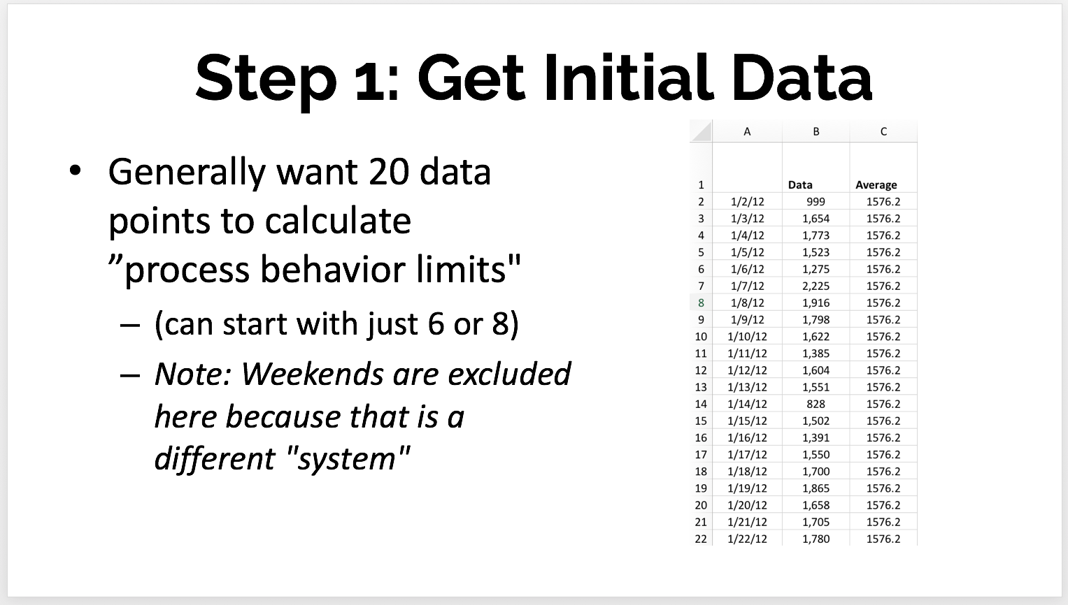
- Calculate the Mean and Moving Ranges
I'll continue with the case where I have 20 initial data points, as shown above.
Calculating the average (mean) of those first 20 points is straightforward. The average here is 1576.2 page loads per day.
The "moving range" (MR) is the absolute value between each two consecutive data points. The first data point doesn't have an MR because there's no previous data point to compare it to.
The Excel formula we use might look like =ABS(C5-C4) -- depending on how the cells in your spreadsheet are set up.
The MR values are always positive numbers. We put those into the table as shown below: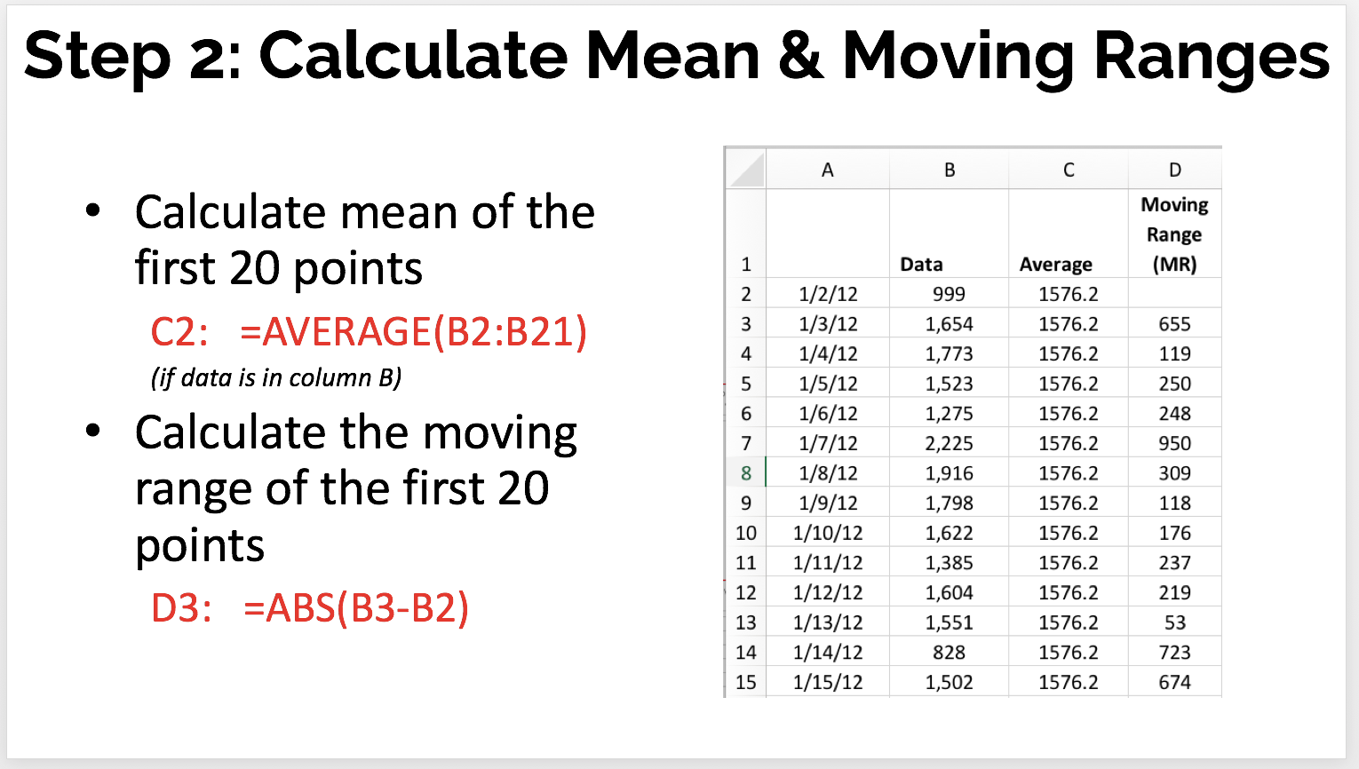
- Draw the Initial Chart
You can draw a line chart in Excel or, better yet, use the functionality in KaiNexus! Don't use "column charts" for time series data, as I blogged about here.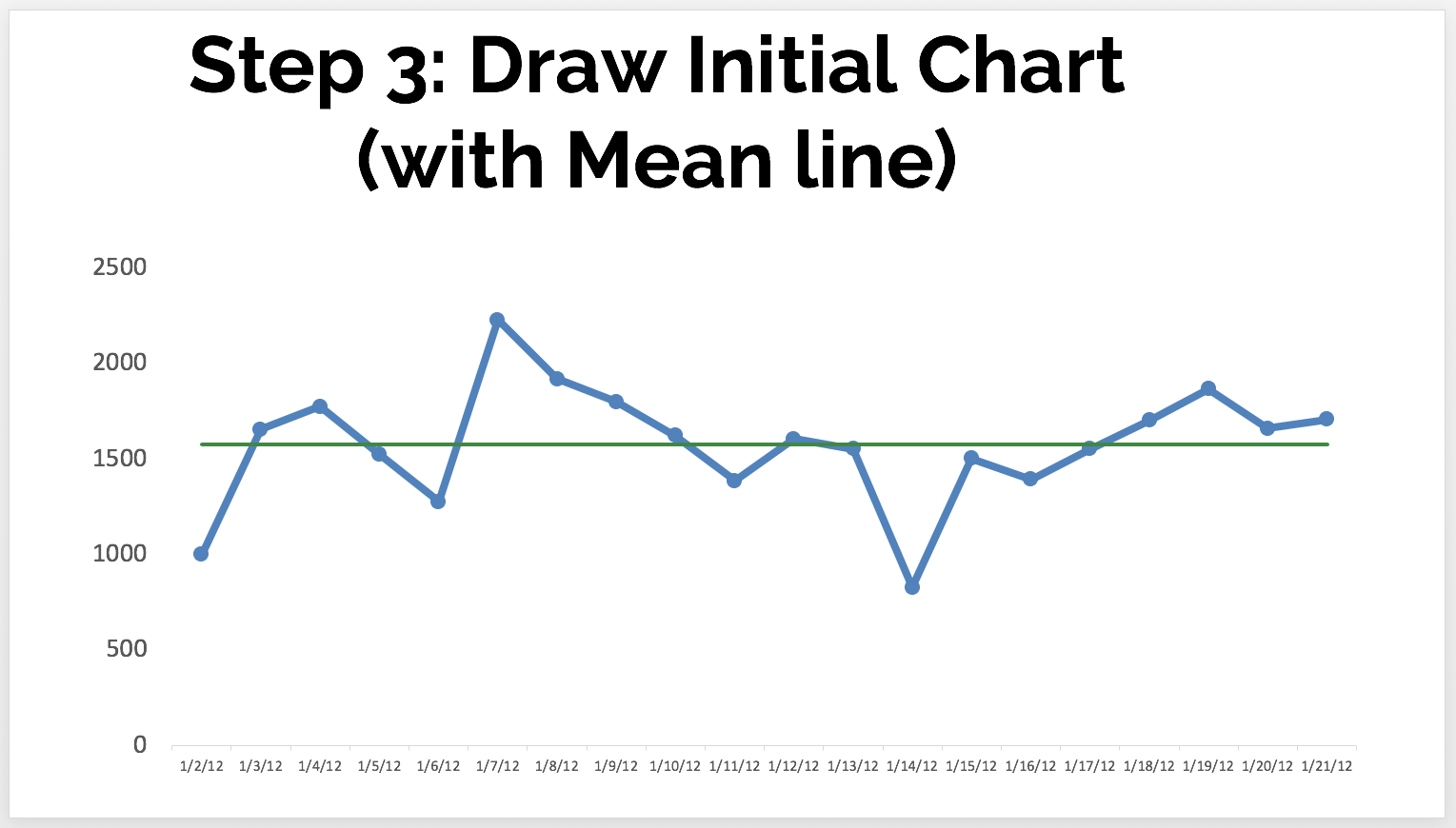
The green line is the mean, or average. In a stable system with consistent performance over time, we'd expect to see about half of the data points be above the mean and half to be below the mean. - Calculate the Control Limits (a.k.a. Natural Process Limits)
Keep in the mind, the control limits in these charts are calculated. We don't get to set the limits based on goals or targets. The control limits are the "voice of the process" and are calculated based on our initial data points.
We first calculate the "MR-bar" or the average of the moving ranges. In this case, it's about 293.
Then, we calculate the 3-sigma control limits, using the MR-bar factor:
LCL = Mean – 3*(MR bar)/1.128
UCL = Mean + 3*(MR bar)/1.128
This gives us an LCL of 797 and a UCL of 2356.
This tells us that, if we have a stable system, we'd predict the next data points would most likely fall between 797 and 2356 -- unless there's a "special cause" signal.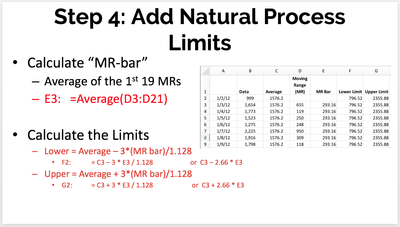
- Review the Chart
We look at the initial chart to see if all of the data points are within the control limits, which suggests a process that is "in control" (or "predictable" -- no data points exceed what are the 3-sigma control limits: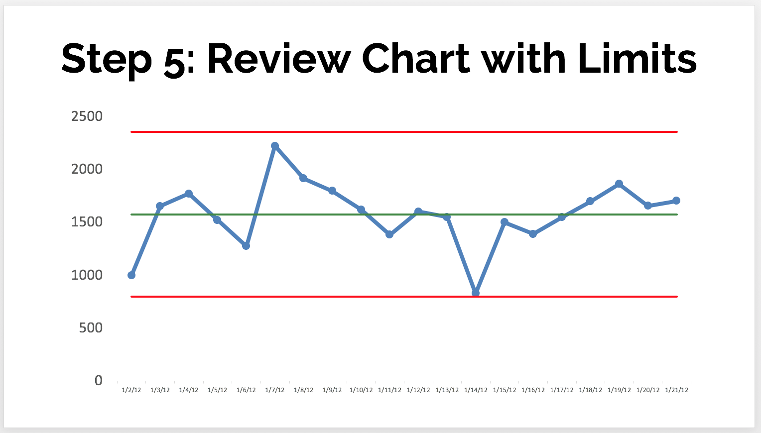
Our other two rules are not triggered, either, as we'll explain next. - Evaluate Over Time
This is the main purpose of the control chart... to help us detect and react to signals instead of reacting any change in the metric the same way.
As we add more data points, we'd notice here that, instead of having a single point outside the control limits... we have a number of consecutive points above the mean -- another indication of a signal or a process shift where we probably have a new average level of performance.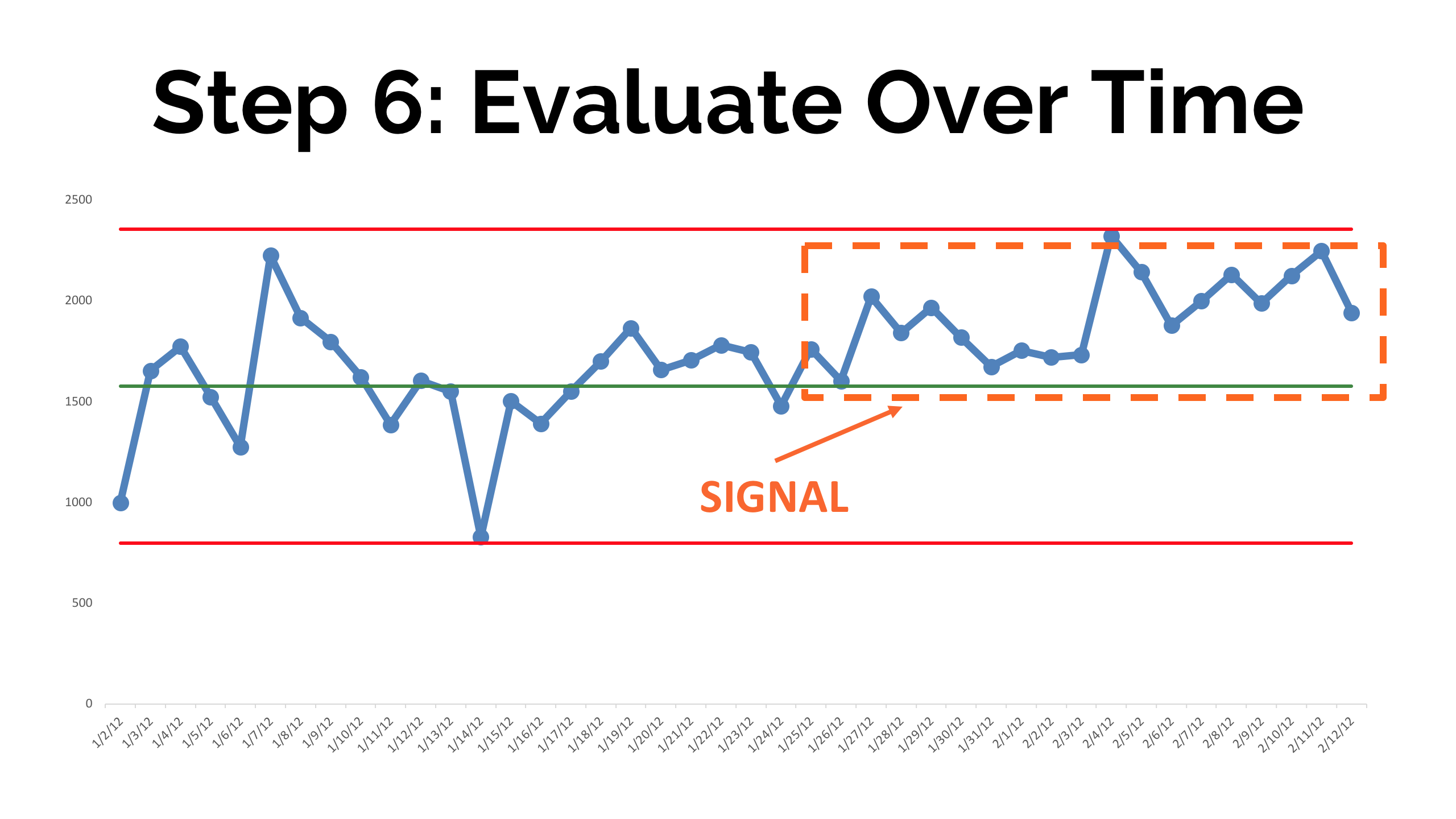
Here are the basic rules that are used for finding signals, below. There are also additional rules that some use to evaluate the charts are called "Western Electric Rules." But, you can keep it simple:
- Rule 1: Any data point outside of the limits.
- Rule 2: Eight consecutive points on the same side of the central line.
- Rule 3: Three out of four consecutive data points that are closer to the same limit than they are to the central line.
Any of those three situations above are statistically unlikely to happen as the result of chance. They indicate signals in the underlying system that creates the metrics.
We should ask "what happened?" and try to understand the "special cause" so it can be eliminated (in the case when performance is worse) or it can be made a permanent part of the system (when performance is better).
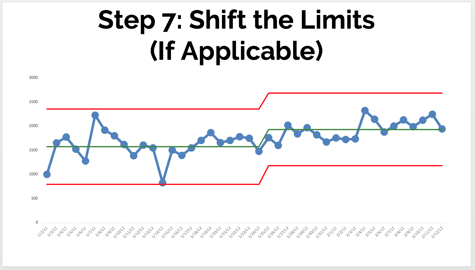
When we have a shift like in the chart above, we'd recalculate the limits based on the new range (for example, the first 10 or 20 points of the new "system" timeframe). Again, don't continually recalculate the limits based on the last 20 points over time.
The new limits might look like this:
I hope that helps. Let me know if we can help you with this methodology!


.svg)


Add a Comment