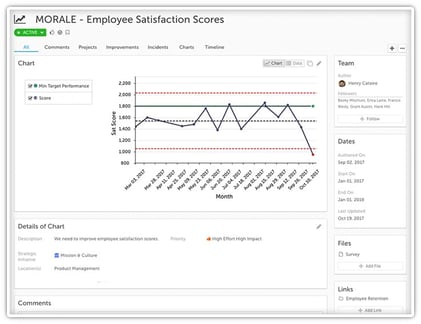
 There is a strong trend in organizations these days to apply improvement tools and techniques that originated on the manufacturing floor to other parts of the organization and other industries entirely. That’s because the basis of these tools and the approach aren’t really related to manufacturing at all. Rather, they are about control, organizational alignment, and efficiency. What organization doesn’t need more of those things?
One tool that we are seeing gain traction in organizations of all types is the process control chart. Control charts can absolutely be used to track the quality and speed at which items come off a production line, but they can also be used to help leaders manage everything from employee satisfaction scores to hospital re-admissions. Because they are new to many non-manufacturing leaders, we get a lot of questions about how they work and how they are best used. Here are a few of the most common.
Listen to this Post and Subscribe to the Podcast:
What is a Process Control Chart?
Process control chart sometimes called “process behavior charts" (or "statistical process control" or SPC) are graphs or charts that display process data or management data across time. They are usually made up of a center line, a 3-standard variation (or 3-sigma) upper control limit, and a 3-standard variation lower control limit. There might be 1- or 2-variation limits displayed, as well. The center line represents the process mean or average (and sometimes the median).
These control limits are determined from historical data. By comparing current data to these limits, you can make conclusions about whether the process variation is consistent (in control) or is unpredictable (out of control).
What are Common and Special Cause Variations?
Common cause variation results from the normal and expected operation of a process or system. Every process has some amount of variation. It's a fact of life. Common cause variations can be seen as are minor non-conformities that are an inherent part of the process, activities, materials and other factors. When all is well (or normal) with a process, you expect to see only common cause variation.
Special cause variation is noticed, for example, when a single data point falls outside of the 3-sigma control limits. This means that something unusual has happened to the process, likely beyond noise, randomness or chance.
For example, if a call center has an average hold time of one minute, you might see that common cause variation creates in this system creates hold times between 30 seconds and 90 seconds, based on historic data. If someone waits on hold for two minutes, there has likely been a process breakdown that should be investigated - a likely "special cause."
It is important to note that some data that falls within the control limits may still indicate a problem in the process. In our call center example, if call times are displaying a non-random pattern, perhaps hovering at the 90-second limit or having six consecutive data points going up or all going down, the process may be heading toward breakdown, as we'd see in those other forms of special cause variation.
What Are the 4 Process States?
Each process falls into one of the process control states at any given moment:
- Ideal State: The ideal state is reached when the process is in statistical control and 100% conformance to specifications or goals is achieved. The process can be predicted and the results are exactly what is expected.
- Threshold state: In this state, the process is generally in statistical control, but there are occasional incidents of non-conformance.
- Brink of chaos state: When a process is not in statistical control, but not yet producing defects, it is said to be on the brink of chaos state.
- Out of control: At this point, the process is producing unpredictable non-conformance.
Why Do Organizations Use Process Control Charts?
Control charts give leaders a clear and consistent way of evaluating and talking about process behavior and performance. They help managers make good decisions about which processes are stable and which require attention and improvement. They help determine process capacity and form the basis for making predictions about future outputs. They also create a baseline for improvement and help determine whether any improvements that are implemented were effective.
How Are Control Charts Implemented?
Implementing control charts is a pretty straightforward process, but proper execution makes a big difference, so careful attention is essential.
Phase 1: Define exactly what will be controlled and measured.
Phase 2: Determine how the data will be supplied
Phase 3: Set the control limits based on historical data
Phase 4: Collect and plot the data
Phase 5: Use the control chart information to assess the process and make decisions
Whether you are a hospital tracking patient wait times, a shipping service tracking on-time delivery, a software company tracking system performance, or any other type of organization, control charts can be a powerful management tool. We’re not at all surprised that they are becoming increasingly popular. Do you have a question that we didn’t answer? Just drop us a note in the comments.
For more information about this topic, check out this free webinar:


Add a Comment