In the twelve years since KaiNexus was founded, we’ve grown from a team of two college friends with an idea of how to improve Lean work in Healthcare to an organization with team members across the country and customers worldwide.
KaiNexus has come a long way in these past twelve years. We’ve worked hard to improve the platform with each new release - increasing accessibility, functionality, capability, and overall user experience. But our next release, 3.0, takes KaiNexus to the next level.
The last time we rolled out an updated interface was the same year the Chicago Cubs won the World Series, Beyoncé's ‘Lemonade’ Album debuted, and the Giant Panda was declared no longer an endangered species. That was in 2016.
The world has changed a lot in the past five years, and so have we. So after five years, it was time to bring KaiNexus into 2021. Not only are we giving the platform a UI facelift with the 3.0 release in early 2022, but we have also dramatically improved the functionality of KaiNexus so that it can better serve as your organization’s solution to managing ALL of your Lean work.
While the new KaiNexus looks prettier, for sure, the underlying reasons for the change are much more important than that. Our new interface is designed to look familiar to your users by adopting current design standards like increased white space and rounded edges, combating the feeling of overwhelm that a lot of new users have. In addition, we’ve worked hard to simplify the layout of every screen, making it more intuitive what to click and how to navigate through the system. We’ve standardized many elements across the app and reduced the number of clicks it takes to navigate through it wherever possible. We’ve also improved the accessibility of the app with bigger font sizes, simpler screens with more white space, and greater color contrast - all of which make the app easier on the eyes. We made these changes to ensure KaiNexus integrates seamlessly into your users’ routine without skipping a beat.
We understand that change is hard, though, and we want to put your mind at ease regarding the changes coming in 3.0. So here are five things you’re probably wondering - and our explanations for them.
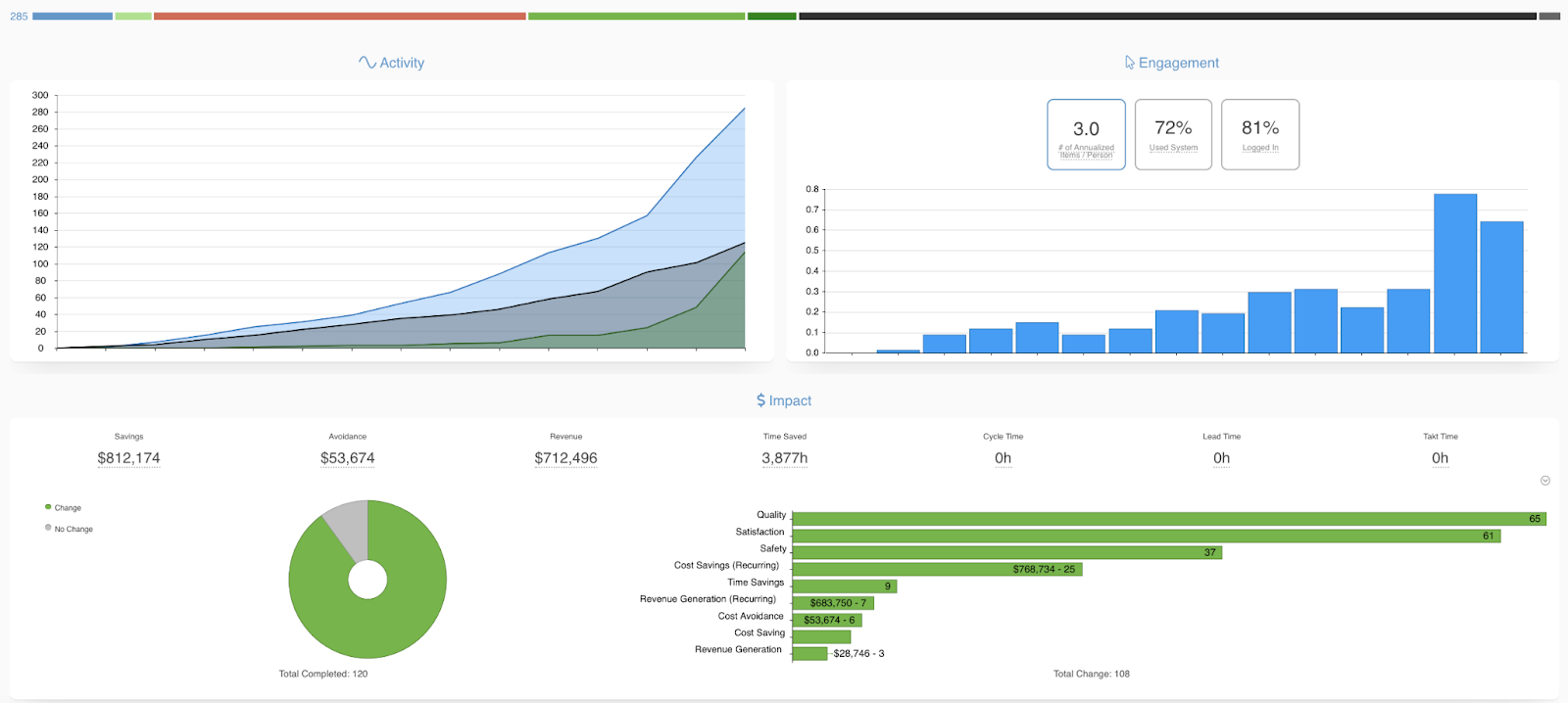
Why did my report snapshot change?
We know that many of you love the Reports Snapshot because it gives you a quick view of the health of your improvement work. The new Snapshot is now Workflow-based and includes a status bar and Activity, Engagement, and Impact reports. You can toggle between Workflows (and multi-select if you want to see everything), and it gives a much-improved view of key reports that shows trends over time. If you want to filter by more than just the Workflow, you can apply Advanced Filters to the Snapshot.
Here’s what it used to look like:

Here’s what it looks like now:
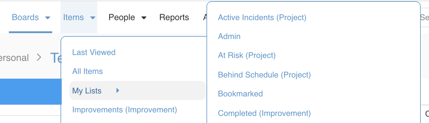
Where did the lists section go?
The “Lists” section is now called “Items.” You still use this area of the app to make Item lists in all of the same ways - it’s just easier to access them in the Navigation Bar. You now can create Boards, Item Lists, and People Lists directly from their respective dropdowns in the Navigation Bar. This change decreases the number of clicks needed to get to your lists.
Why isn't the Navigation Bar on the left?
The Left Advanced Toolbar has moved to the top of the screen and is now referred to as the Navigation Bar. This change of location gives you easier access to the different areas of the app and reduces the number of navigation clicks to get to what you’re looking for while simultaneously increasing the available work area on your screen. Now, instead of having to go to the area and then navigating to a point within the area, it is now possible to directly navigate between sub-sections with fewer clicks and less load time!

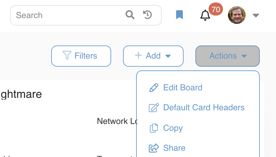
Where did the ellipses go?
Wait! Where did the ellipses go? In the name of simplification and consistency, we’ve put Advanced Filter, Add, and Action buttons at the top of the screens across the app. Anything you would find under the ellipses you can now find under the Action button. You still have all the capabilities you had before; we’ve just streamlined how you get to them. What shows up in the buttons varies slightly based on where in the app you are (for example, the Add button on Boards shows what Cards to add while the same button in the People section adds new users), but trust us. It’s intuitive and will feel immediately familiar to you.
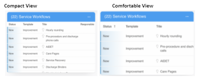
Why do my lists look different?
You can now customize the density of Items in lists across the app, giving yourself more (or less) white space. White space creates a simpler, calmer experience for your users, while increasing the density allows more information to be displayed on the screen. All your previous lists will stay exactly the same (Compact View), but any new list you create after 3.0 will default to the new layout style (Comfortable View) - although you can always change it back. In addition, you can pick which to use based on your goal for that list!
It is very true that nothing in life is permanent except for change. Although change is uncomfortable, trust us that these changes - that may seem big now - are going to make your experience in KaiNexus and your improvement journey more impactful. Reach out to your CSM with any questions you have.


.svg)


Add a Comment