With KaiNexus’s powerful, real-time Reports, you can get unparalleled visibility into the health of every aspect of your improvement culture - activity, engagement, and impact. You can see bottlenecks before they get out of control and take action to rectify them. With all the awesome changes that have been happening in the Reports, you may have missed some important new features.
Here are 4 tricks, tips, and explanations that will help you get the most out of your organization’s improvement efforts.
Filter by Location
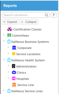 Suppose you only want to see information about improvement work from certain areas of your organization - such as the department you work in or the team you manage.
Every KaiNexus Report, including the Snapshot, includes a locations sidebar along the left side that allows you to filter that Report by location.
- Use the search box to look for a specific location.
- Filter results by Level Types (e.g. all departments, hospitals, or factories).
- View the whole Network in the sidebar.
- Display only the top levels of your organization.
To select multiple locations, hold down the ctrl key while clicking on each location.
Choose whether you want to include Project-Based Improvements
Project-based Improvements are related to your top-down improvement work (such as Hoshin Kanri), while stand-alone Improvements relate to your bottom-up improvement work. So wouldn’t it be great if you could separate the two types of work when looking at Reports?
Two Reports - the Submission vs. Completion Report and the Impact Summary - let you choose whether to include all Improvements, only those which are part of a Project, or only those which are not part of a Project.
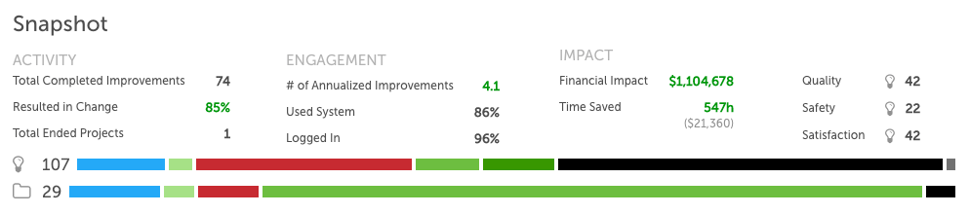
Understanding the Reports Snapshot
The Snapshot is a great tool for getting an overview of every aspect of your organization’s improvement culture. The top half of the Snapshot gives insight into the activity, engagement, and impact of all Improvements completed during the selected time period. If you want to know more information about any of those topics, take a look at the individual Reports listed beneath the Snapshot.
The Improvement Status Bar lets you see the statuses of all Improvements submitted in the select time period: new, overdue, planned, active, resolution submitted, completed, and deferred.
Want to see a list of all Improvements with a certain status? Just click on that colored bar.
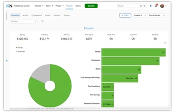
Working with the Impact Summary
 One of the best ways to inspire engagement with your organization’s continuous improvement efforts is to show the impact of previous efforts. With the Impact Summary, you’re able to see the impact of completed Improvements over time and across locations, while getting visibility into the overall change rate and impact types.
You can see the monetary impact of the improvement work displayed across the top of the Report. That includes the total cost savings, generated revenue, and the soft savings due to saved time.
The donut chart displays the change rate - the percentage of Improvements resulting in some impact. If you want to see the breakdown of what kinds of impact were had, click the green portion of the chart and check out the bar graph to the right. If you want to see the breakdown of reasons for Improvements having no change, click the gray portion of the chart and check out the bar graph.
If you’re curious about which specific Improvements had a certain impact or “No Change Reason,” just click the correlating bar on the bar graph. A list of all Improvements meeting that qualifier will be listed.


.svg)


Add a Comment