 A Bowling Chart is a simple, visual way to monitor Key Performance Indicators (KPIs) or policy deployment objectives, letting you compare your actual metrics to your targets and goals. The term “Bowling Chart” is derived from the chart’s similarity to the appearance of a bowling scorecard, although there’s often 12 months in this type of Bowling Chart instead of ten frames when we’re bowling.
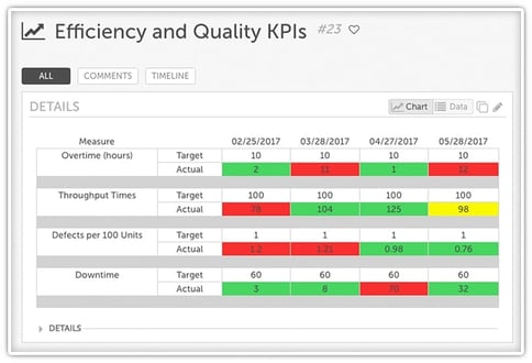
For each KPI on a Bowling Chart, there are two rows: the actual value and the target value. Typically, there are three colors used on such a chart:
- Red: KPIs performing worse than the target in that time period.
- Green: KPIs have met or surpassed the target in that time period.
- Yellow: KPIs have met a secondary, less-ambitious target, although not the primary target.
There are sometimes variations, where “light green” means the organization is on track to meet the objective by the end of the year and “dark green” means they have already achieved that target.
Strengths of Bowling Charts
Bowling Charts are an easy way of checking in on how often your goals were met or missed. If you’re looking for that basic information, this may be the perfect tool for you. But if you’re interested in looking at trends, you may need to add another type of analysis to your improvement arsenal.
Limitations of Bowling Charts
As our VP of Improvement & Innovation Services, Mark Graban, put it in our webinar on improvement metrics, even though a Bowling Chart may answer the question of, “Are we hitting our goal or not?” it doesn’t answer the bigger question of “Are we improving?” A bowling chart is “visual” in the sense that we see colors (unless a manager is color blind!), but run charts or process control charts help illustrate trends in a way that Mark argues makes it easier for us to continuously improve - not just hit a target (and then stop because it's green).
It's ironic that "red" is usually the color for "Stop" when we're driving in traffic... but that's a different story.
One of the biggest problems with Bowling Charts is that it can be hard to draw specific conclusions from them.
Why? It can be difficult for people to draw anything other than the most simple conclusions from a table of numbers - whether they’re looking at data over time or comparing this year to last year. We are, after all, very visual creatures, and big batches of raw numbers like this make it hard to spot trends.
And trends matter! They can tell you if your organization is improving, if it’s getting worse, if it’s stable, so charts that are more visual, such as run charts, are much better at conveying that information quickly and efficiently.
The best approach is using bowling charts and run charts together -- bowling charts to check whether you're hitting targets, and run charts to see whether you're actually improving over time. KaiNexus makes this easy by displaying both views against the same underlying data, so leaders don't have to choose between "did we hit the goal?" and "are we getting better?"
Creating Bowling Charts in KaiNexus
KaiNexus supports bowling charts alongside run charts, control charts, and other performance tracking tools -- all connected to the improvement work driving the metrics. That means when a KPI turns red, leaders can drill directly into the improvement projects aimed at moving it back to green. See the step-by-step setup instructions on our support site, or see KaiNexus in action →
Bowling charts are a useful starting point for KPI tracking. They become more powerful when paired with trend analysis and connected to the improvement work behind the numbers.
Frequently Asked Questions
What is a bowling chart?
A bowling chart is a visual management tool that compares actual KPI results to targets over time, typically across 12 months. Each metric is color-coded -- green for meeting or exceeding the target, red for missing it, and sometimes yellow for partial achievement. The format resembles a bowling scorecard, which is where the name comes from.
What is the difference between a bowling chart and a run chart?
A bowling chart shows whether you hit your target in each period. A run chart plots data points over time to reveal trends, shifts, and patterns. Bowling charts answer "did we meet the goal?" Run charts answer "are we improving?" The most effective organizations use both together.


.svg)


Add a Comment