View the complete release notes here.
Let’s take a look at some of the highlights:
UI Enhancements
We have made a ton of subtle but sleek changes that have really polished up the KaiNexus interface. You’ll notice some changes almost instantly, such as the Notification Bell being moved over next to the search bar and the board editing menu shifting from the left to the right-hand side of the screen. Another big addition is the ellipsis. The ellipsis replaces the gear icon in KaiNexus and you’ll see this just about everywhere. The ellipsis means that there are more options available. The ellipsis shows up on Boards and Cards, as well as on Improvements, Projects, and Tasks. You’ll see that on Projects, for example, the additional options such as "Export," "Transfer," and "Copy" all fall under the ellipsis.

Template Nesting
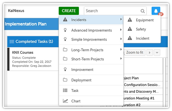
Clicking the "Create" button now gives you a completely different drop-down view. You can nest Improvements, Projects, and Tasks in folders to create any custom workflow you want. Let’s say for example you are managing Lean certification in KaiNexus. You can group your Cohort, Learner Profile, and Yellow Belt Project all under a folder titled Certification. You can also restrict templates to only be created inside of other templates or hide a template altogether from the "Create" screen. For example, you can restrict the creation of a Countermeasure task to only be an option under A3s.

Customized Layout
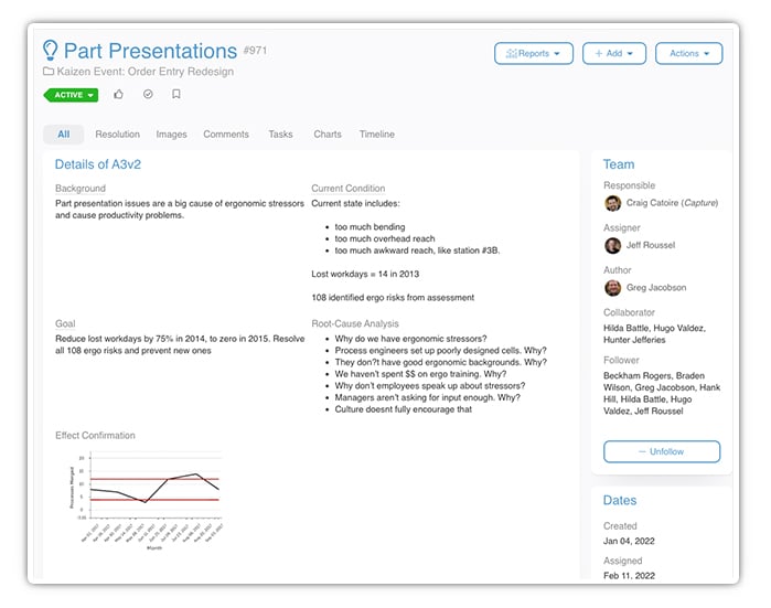
Want to make your A3 project template in KaiNexus look exactly like your A3 paper form? Now you can with the customized layout. Work with your Customer Experience Lead to put a personalized touch on your A3 Project to make sure it looks just like your form and fits on your 11.7 x 16.5 A3-sized paper.

"Like," Acknowledge, and Bookmark
I really LIKE this next feature... see what I did there? You can now "like," acknowledge, or bookmark Improvements, Projects and Tasks, as well as "like" or acknowledge comments in KaiNexus! Use these buttons to say that you love an awesome idea or that you saw a comment that was directed to you. You can even filter lists of Improvements, Projects, or Tasks by whether or not you've marked them in these ways.
This is pretty handy! For example, you can create a list with all the bookmarked Projects you want to highlight in your Monday morning meetings.

Gantt View
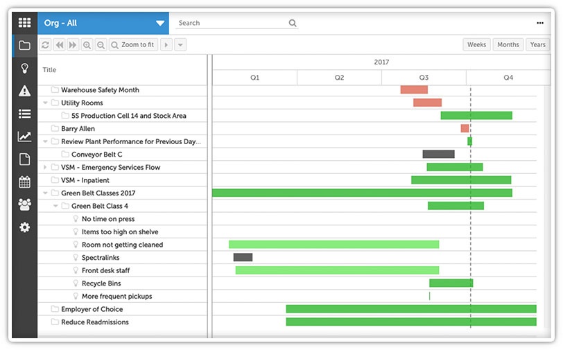
Our last major improvement of this release is the Gantt View! We’re excited to be releasing this frequently asked for feature. With the Gantt View, you’ll be able to visualize your improvement schedule on a timeline. You’ll get insight into key dates of each item and can easily see the dependency relationships between items. You can look at any Improvement, Project, or Task lists in the Gantt View and can even create Cards in the Gantt View.

These are only some of the great changes we’ve made. Take a look at our complete release notes for more.
What new features are you most looking forward to using? We'd love to hear from you!


Add a Comment