 We had the honor of hosting a webinar with our Senior Adviser, Mark Graban, author of Measures of Success: React Less, Lead Better, Improve More as the presenting guest. Mark’s book focuses on managing variation, understanding data, and leading improvement. Mark has been a part of KaiNexus in various capacities since 2011. In Addition to Measures of Success, he is also the author of Lean Hospitals, Healthcare Kaizen, and Practicing Lean.
Over the last couple of years, Mark has been interested in how management can focus on process behavior charts to differentiate between signal and noise. This post is a recap of Mark's presentation. However, the webinar contains many more valuable examples, so we highly recommend that you watch the webinar.
How to Use Process Behavior Charts to Improve: Case Studies
Presented by Mark Graban, author of
"Measures of Success: React Less, Lead Better, Improve More"

In previous webinars, Mark Graban has introduced the potential rewards for using Process Behavior Charts -- including why they are a better alternative to "bowling charts" and how they help us not react to every uptick or downturn in a metric. However, viewers wanted more information - and here we'll deliver!
In this webinar, you will:
- See various examples of Process Behavior Charts from the workplace and from data that we see in the news
- Understand the difference between "signal" and "noise" in a metric
- Learn when to react to a single data point (or another meaningful signal in the data) to trigger immediate Root Cause Analysis
- Know when to step back and improve a system using a more systematic, less reactive approach, like A3 Problem Solving
- Use Process Behavior Charts to perform hypothesis testing -- was your change really a significant improvement or not
- Apply Process Behavior Charts to situations where individuals or organizations are being ranked in performance
What is a Process Behavior Chart?
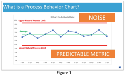 A process behavior chart is essentially a run chart. (Reference Figure I.) The blue dots and the lines are the data for this metric. In addition to the data points, we also calculate and plot an average. Finally, we calculate and plot what are called the upper and lower natural process limits. (Check out this webinar to learn how to calculate the natural process limits.)
The example chart shows data that is just fluctuating around an average. We could say that all of these data points represent noise. What this tells us is that there is a consistent process that is generating predictable results. One might not like the level of performance, but the good news is that it is likely to remain predictable. Future performance is going to fall somewhere between the upper and lower limits. Because we only have noise, we don't need to figure out why one data point is lower or higher than the next. If we don't like the level of performance, we need to focus on figuring out how to improve the system.
How To Find Signals?
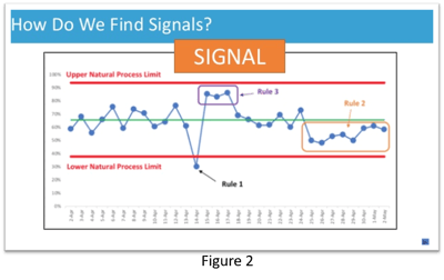 A signal is a data point or group of data points that are not likely to be just randomly occurring, indicating that something has changed in the system. (Figure 2.) One signal is any data point that is outside the upper and lower limits. (Rule 1.) It is appropriate to ask why and figure out what happened when this occurs. The second type of signal occurs when you have eight consecutive data points that are above or below the baseline average. (Rule 2.) That's also unlikely to be randomly happening. It's a signal that something has changed in the system, and hopefully, we know what that is. The third type of signal is a cluster of either three consecutive or three out of four data points that are closer to the control limits than they are to the average. (Rule 3.)
An Example of Using Process Behavior Charts Retrospectively
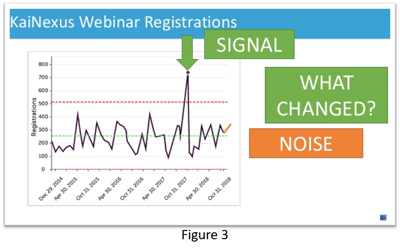
Once we have the chart plotted and have identified signals, we can ask, "Did something really change significantly?" in the system or not. As an example, we took a look at registrations for this webinar. The registration statistics look like this:
- 352 registrations
- That’s the second most for this year
- Registrations are above average
- Registrations are up 26.6% from last month
All of these statements are true, but they don't give us a lot of insight into the performance of our system. There's nothing in those numbers to help us determine if these results indicate a signal or whether it's just noise. What can do that is a process behavior chart.
If we plot out webinar registrations going back to 2014 (Figure 3), you can see that most registrations hovered around the average. Still, we did have one that exceeded the upper control limit. It was a webinar by Jess Orr on how to use A3 thinking in everyday life. It had over 700 registrations. That webinar was a signal because we had a data point above the upper limit. It was not randomly occurring, so we need to ask why the results of our webinar promotion were different in this particular case. Did we send more reminders or use a different language? Perhaps Jess Orr is a top-rated speaker.
A Look at the 2018 Midterm Elections
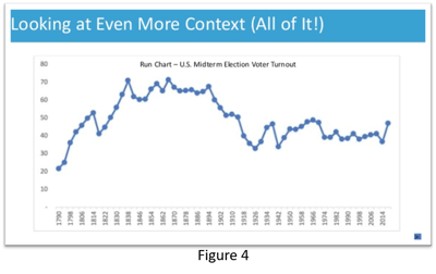 Another good illustration for separating signal from noise is the 2018 midterm elections. We saw headlines that read, "Voter Turnout Soared for the Midterms." Another read, "Americans Turned Out to Voate in a Level Not Seen in a Century." And still, another said, "The 2018 Midterms had the Highest Turnout Since Before WW I." We know from looking at other data sets that a number that is the highest in years doesn't necessarily indicate that it is statistically out of line with the expected results of the process. It could very well be noise.
So to give it some context, we created a run chart going back to 1790. (Figure 4.) Was 2018 really record-setting? Maybe for the last 50 years, but the chart tells a different story. This analysis reminds us that it is not necessarily useful to have charts that only show this year's data or last year's data in the workplace. We want to be careful that we are not showing such a limited time frame that it changes the conclusions that one might draw.
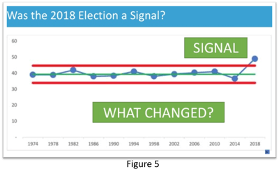 We also created a process behavior chart going back to 1974 (Figure 5), when turnout fluctuated around an average of 40%. Using this stable process chart to predict turnout in 2018, we would have expected it would be somewhere between 34% and 45%. It turned out to be almost 50%, which does represent a signal because it falls above the old upper limit. Something changed in the system. It then makes sense to figure out what changed and why.
In this case, if we believe that voting is desirable behavior, we might take steps to amplify the change and encourage more folks to vote. Perhaps it was the increase of mail-in voting or extending voting hours. A root cause analysis would be indicated.
More Examples
There are many other headlines that make it sound like something significant has happened, only to turn out to be noise in a system fluctuating around an average. Examples include emergency room wait times in Canada, automobile accident fatalities in the US and pedestrian fatalities.
When discussing the decline in fatal accidents between 2016 and 2017, the NHTSA said they were encouraged by the fall but commented that "There is no single reason for the overall decline." This is a wise statement, given that the decline in deaths is an indicator of noise in the system rather than a signal, which likely would have an identifiable cause.
Testing Counter Measures
In life and the workplace, we sometimes implement changes to try to improve the system and encourage desirable behavior. One example is Washington DC, where they are debating eliminating right turns on red lights at some intersections to reduce accidents and save lives under the theory that the practice is dangerous for pedestrians. However, experts disagree whether the move would increase safety or increase risk.
Should they implement this countermeasure, and then see a drop in pedestrian fatalities that goes below the lower control limit, could the conclusion be made that the ban on right turns on red caused the change? Not really. One data point is a signal, but it could just be a blip, or there could have been other factors that caused the change. To determine that a countermeasure has been effective, you need to see a sustained shift in the data.
How to Analyze Chunky Data
If you are trying to chart rare events, such as central line infections in a hospital, which don't happen very often and hover around an average of one, your process behavior chart may make everything look like noise when it really isn't. An alternative is to chart the days between events. When you see spikes in the number of days between events that exceed the process control limits, you might find signals that indicate it is necessary to find out what caused the change to the system.
Using process behavior charts can help you react less by seeing through the noise and only worrying about data that indicates a valid signal. In addition, it can help you lead better by gaining more understanding of cause-and-effect relationships. When you react less and lead better, you can ultimately improve more which is the goal.


.svg)


Add a Comment