KaiNexus lets you get your data out in the open where everyone can see it, keeping it all in one place so that your whole team knows where to find it.
There are tons of tricks you can use to make creating your KaiNexus charts easier. Here are some of my favorites:
Quickly Copy Columns of Data from Excel into Your Chart
If you've been storing data in an Excel document and have decided to move it to KaiNexus to create a knowledge repository, you may have a ton of data to migrate. Rather than enter each data point manually, copy it into KaiNexus one column at a time.
- Create a new chart or navigate to an existing chart and click “Edit.”
- Choose whether the chart should use dates or categories, and add any series as you normally would.
- Click “Build Rows” and generate the correct number of rows for the data set you plan to copy.
- Open the spreadsheet containing your data.
- Select an entire column of data - excluding any headings. Click “Copy” or hit ctrl+c to copy the data.
- Go back to the chart window in KaiNexus and click inside the first data box in the corresponding column. Either right click and then click “Paste” or type ctrl+v to paste the data.
- Repeat the previous steps as many times as necessary to copy each column of data into KaiNexus.
Calculated Series
We’ve recently made it easier for you to have data series derived from your other data. You can quickly add an automatically calculated data series on your chart. The data in this series will be automatically updated as you edit the values from which it derives its data.
The calculated series can be a:
- Sum
- Difference
- Average
- Percent
- Percent Change - The percent change represents the degree of change over time as a percentage.
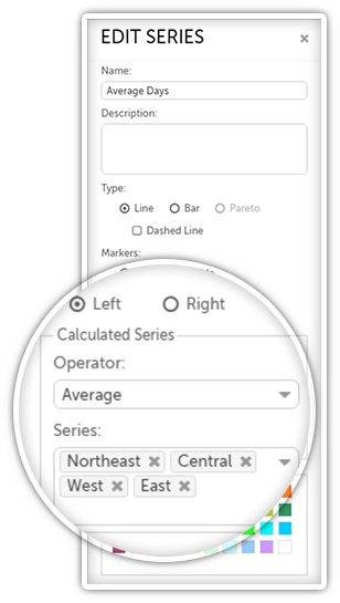 To add a calculated data series to your chart:
- Create a new chart or navigate to an existing chart and click “Edit.”
- Add your manually entered data series as you normally would.
- Add the calculated data series.
- In the “Operator” drop-down field, choose which operator the calculated series should use. Depending on which you pick, various new fields will appear. If you choose:
- Sum: Enter each series you want to have added together in the “Series” field.
- Difference: Enter the series you want to subtract from in the “Series to subtract from” field and the series you want to subtract from the “Series to subtract” field.
- Average: Enter each series you want to be included in the average in the “Series” field.
- Percent: Enter the series you want as the numerator in the “Numerator Series” field and the series you want as the denominator in the “Denominator Series” field.
- Percent Change: Enter the baseline series in the “Baseline or Original (% change from)” field and the current series in the “Actual or Current” field.
- You should also give the series a name and, optionally, a description, choose whether it should be a line, dashed line, or bar, pick with which axis it should be aligned, and pick its color.
Set Control Limits
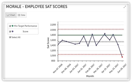 With control limits, you can easily create control charts to monitor performance. You can even have the chart generate an alert should it become out of control. That way, you’ll never miss out on important information.
It’s easy to do!
- Create a new chart or navigate to an existing chart and click “Edit.”
- Enter your data as you normally would.
- Click “Options.”
The control limits settings are at the bottom of the resulting window. You can:
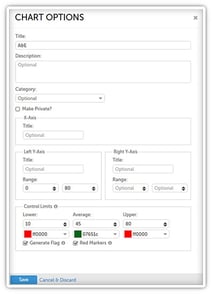 Enter the lower, average, and/or upper limits and pick a color for each.
- Check the box next to “Generate Flag” to have an alert triggered for all members of the chart’s team if the data that is entered is out of control - i.e. when a data point surpasses the upper or lower limit. In addition to the alert, a red exclamation point will be displayed alongside the chart’s name on any list of charts.
- Check the box next to “Red Markers” to make data point markers red if the point is out of control. Note that markers must also be enabled on the data series configuration for this setting to take effect.
What tricks and tools have you found to be the most useful when working with charts in KaiNexus? We’d love to hear from you in the comments below!


.svg)


Add a Comment