 Donald J. Wheeler, Ph.D. is a world-renowned expert in statistical methods and continuous improvement. He's worked with W. Edwards Deming and wrote the classic book Understanding Variation. Wheeler also wrote the foreword for Measures of Success, written by our KaiNexus colleague Mark Graban.
Wheeler once wrote and said, "Statistical Process Control is, at its heart, about getting the most from your processes. It is about the continual improvement of processes and outcomes. And it is, first and foremost, a way of thinking... with some tools attached."
I’d like to thank him for providing the perfect quote for a blog about process behavior charts because measurement, learning, and improvement are exactly what they are designed to enable.
What is a Process Behavior Chart?
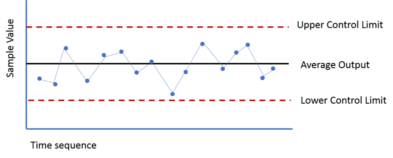
Process behavior charts are graphs or charts that plot out process data or management data (outputs) in a time-ordered sequence. It's a specialized run chart — typically adding a center line, a plus-3-sigma upper limit, and a minus-3-sigma lower limit. There might be 1- or 2-sigma limits drawn in, as well. The center line represents the process mean or average (and sometimes the median).
Listen to this Post or Subscribe to the Podcast:
The control limits are calculated from the baseline process variation and show us what's typical or "common cause" variation. Those limits are calculated to help us, along with a few simple rules, distinguish between "signal" and "noise." Again, these are calculated... they are part of "the voice of the process" and you don't get to choose what the limits are. If you don't like the control limits or think they are too wide, you have to improve the process to reduce variation and noise, which is different than asking "what went wrong?" in any given time period.
As leaders, we want to make sure we aren't wasting our time (or our employees' time) by asking for explanations about the noise. If we're going to ask "what happened yesterday?" we want to make sure we are reacting to a statistically significant signal in the data. One of those signals is a data point outside of those 3-sigma control limits.
Again, control limits are usually set at plus/minus three sigma around the average. This is because in the early 20th century, when Walter Shewhart, one of the founders of the modern quality movement, formalized the ideas used in control charts, he determined that, if any single measurement is within those 3-sigma limits, it is considered “expected” behavior for the process (and Wheeler's modern-day writing explains why this is the case).

Variation
When a process is stable (or "in control"), as in the above example, you see nothing but common cause variation — noise, no signals. Common cause variation results from the continued predictable operation of a process or system and it is the result of consistent factors including the design of the process, routine activities, materials, and other factors.
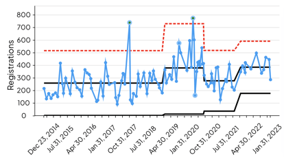
When a single data point falls outside of the control limits, something unexpected has happened to the process. Something unusual has caused the process to become out of control. This is one example of special cause variation. It indicates that it's very unlikely that the data point is due to noise, randomness, or chance. It's a signal that something changed and that's a time to investigate and learn -- whether it's a signal of improvement or a signal of the metric being worse.
It is important to note that process control charts can reveal problems even when all of the data points fall within the control limits. If the plot looks non-random, with the points exhibiting a form of systematic behavior, there may still be something wrong.
For example, if we have eight consecutive data points that are all above or below the average, that's statistically unlikely to be due to chance. Statistical methods to detect sequences or nonrandom patterns can be applied to the interpretation of control charts. In control processes display random deviation within the control limits.
The "Western Electric Rules" give us additional guidelines for determining what is likely a special cause.

The 4 Process States
At any given time, each process falls into one of four states:
- The ideal state occurs when a process is in statistical control and produces 100 percent conformance to specifications or goals. The process is predictable and produces expected results.
- In the threshold state, the process is in statistical control but occasionally exhibits non-conformance at times.
- The brink of chaos state refers to a process that is not in statistical control but is not producing defects. This is usually a precursor to the last state;
- The process is out of control and is producing unpredictable non-conformance.
Each process fits into one of these states at a particular point in time, but will not stay in that state. All processes will move toward the chaos of their own accord, over time, without due attention. Most companies only recognize the need for intervention and improvement when the process has moved to an out-of-control state. Control charts help organizations recognize process deterioration so that improvements can be applied to processes in the threshold or brink of chaos state.
Benefits of Process Behavior Charts
Organizations that practice continuous quality improvement use control charts to:
 Provide a simple, common language for talking about process performance and behavior
- Make informed decisions about which processes to leave alone and which to subject to an improvement cycle
- Limit the need for inspection
- Determine process capability based on past performance and trends
- Predict future performance if the system is stable and in control
- Assess the impact of process changes
- Visualize the performance of the process over time
- Create a baseline for future improvements
- Communicate the performance of a process
Implementation
There are a few basic steps to implementing a control chart.
Step 1: Define what metrics need to be or monitored or improved
Step 2: Determine the measurement system that will supply the data
Step 3: Establish the control limits based on some baseline data (ideally 15 to 30 data points, but you can start with as few as four, per Wheeler).
Step 4: Collect and chart the data
Step 5: Make decisions based on the correct interpretations control chart information and rules
Process behavior charts are popular with manufacturing organizations using the Lean or Six Sigma business methodology, but they can be of great value when applied to any process that has measurable outcomes that can be tracked over time. Businesses of all types can benefit from this simple, yet powerful way to visualize process performance.


Add a Comment