Most metrics reviews follow the same pattern. Someone pulls up the dashboard. A few numbers are red. The room reacts. People start drafting explanations for numbers that went down, and nobody asks whether the drop actually means anything.
That cycle -- react, explain, move on -- feels productive. It keeps people busy. But busy isn't the same as effective.
Here's what I've noticed working with improvement champions across industries: the ones who consistently make sharper recommendations aren't working harder than everyone else. They're looking at the same data through a different lens. And that lens changes everything about where they spend their time.
What Bowling Charts Can and Can't Tell You
A "bowling chart" (also known as a "bowler") -- the familiar grid of numbers with red and green color coding against targets -- answers one question: "Did we hit the number this month?" That's useful, as far as it goes.
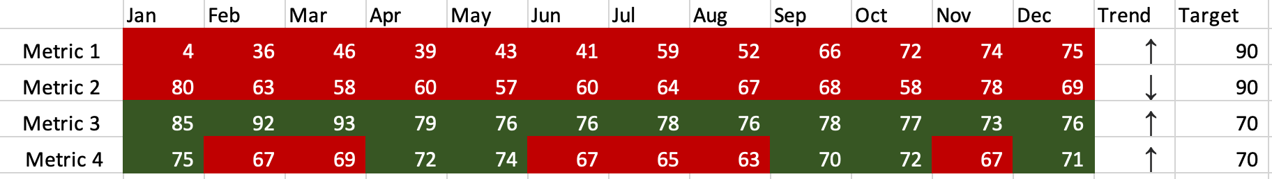
But it can't answer the question that matters more:
"Has anything actually changed?"
A number can flip from green to red through routine fluctuation (a.k.a. "common cause variation"). The system didn't get worse. The target didn't move. The data just did what data does -- it varied. And if leaders treat every red box as a problem requiring investigation, the team ends up writing explanations for noise. That's not improvement work. That's fiction writing.
As I wrote in my book Measures of Success, if every red number is a priority, then nothing is.
Control Charts Show You What the Data Means
This is what I'll be talking about at KaiNexicon this year -- the 10th Annual KaiNexus User Conference, April 15-17 in Austin.
The "control chart" functionality already built into KaiNexus does something a bowling chart can't:
It separates signal from noise. It shows you which data points represent a real change in the system and which ones are just the system doing what it's always done.

That distinction changes the conversation. Instead of chasing every dip, you can walk into a metrics review and say, with confidence, "These three red boxes are routine variation -- the system is predictable. But this one is different. Something changed here, and it's worth understanding why."
That's a different kind of credibility. You're not the person who explains what happened last month. You're the person who knows what it means.
You Don't Need Permission to See More Clearly
One thing I want to be clear about: this isn't a "tear down your dashboards" talk. The executives can keep their bowling charts. You don't need to overhaul anything. You don't need buy-in from leadership to start looking at control charts on your own.
What you gain is a personal advantage -- a sharper filter for where to focus your limited improvement time and attention. You stop spending energy on noise and start directing it toward the signals that matter. That's a shift that changes how you work even if nobody else in the room has made it yet.
And in my experience, it tends to spread. When your recommendations start landing more often, people notice. They start asking how you're seeing what you're seeing.
What to Expect in the Session
I'll walk through real examples of bowling charts that triggered reactions and the control charts that told a completely different story. We'll look at the rules that identify signals -- data points that genuinely deserve investigation -- and the patterns that tell you a system is just fluctuating within its normal range.
If you're already using KaiNexus, you have access to this capability right now. What we'll work on together is the thinking behind it -- the shift from "what happened?" to "what does it mean?"
Join Us at KaiNexicon
KaiNexicon 2026 runs April 15-17 in Austin, Texas. It's a small, focused conference -- the kind where you actually talk to people and leave with ideas you can use the following week.
If you've ever sat in a metrics review wondering whether the numbers everyone is reacting to actually deserve the reaction they're getting... this session might change how you show up in those rooms from now on.
What would you do with all the time you currently spend explaining noise?


.svg)


Add a Comment