We’ve written a few posts introducing process control charts and explaining why they are so useful. Today we want to dig a little bit deeper and get into the weeds of actually putting them to work.
As we’ve noted, a process control chart is a graph used to monitor how a process behaves over time. Data are plotted in time order. A control chart always has a central line for the average (sometimes a median), an upper line for the upper control limit, and a lower line for the lower control limit. These lines are calculated from historical data and usually cover three standard deviations from the mean.
Process control charts help get managers out of the trap of overrreacting to every up and down in the data. It also helps avoid problems caused by only looking at average results. Instead, they help leaders understand the variation of results. Why does variation matter? Consider an example, if you are planning an event and are told that the average age of attendees is 32, you might ponder a swanky cocktail party. But in reality, your guests might include many children and elderly people, who aren’t interested in a dry martini. More information is always better.
So where to begin? Here is a quick guide to implementing and using process control charts.
Step 1: Select Measurement Method
Process control charts allow for the analysis of data and trends over time, so to begin, you need to decide what data you will collect. There are a couple of types of data that are used in control charts: variable and attribute. Variable data is the result of measurements on a continuous scale. It includes things like time, weight, temperature, or size. It is objective. Attribute data, on the other hand, includes arbitrary distinctions like pass/fail, good/bad.
Step 2: Validate the Accuracy of the Measurement System
One important step that companies often overlook is validating that the data being input into the control chart is correct. If you put bad data in, you’ll make flawed decisions and potentially make processes worse. It is smart to conduct periodic spot checks on your measurement system.
Step 3: Determine Where Data will be Stored
The best approach is to pick an improvement platform that has control chart capabilities. That makes it possible for all of the stakeholders to have access to the information and to create a history of the process results over time.
Step 4: Begin Collecting Data
Develop a plan to gather the data at a determined frequency. The people who will be collecting the data should be trained in the proper way to measure and chart the results.
Step 5: Craft and Document the Reaction Plan
You’ve got your control chart and some data, but now what? It is necessary to have a defined reaction plan that lays out what will happen when a process enters an out-of-control or nearly out-of-control state. Flow charts, the "Western Electric rules," and other decision trees can be useful here.
For more information about how (and whether) to react to the data in your control charts, check out this recent post on LeanBlog.org!
Step 6: Calculate Control Limits
Once you have started collecting data (usually 20 – 25 data points) you can calculate the upper and lower control limits, usually three standard deviations from the mean.
Step 7: Assess Whether the Process is in Control
There are several forms that an out-of-control process can take. Here is what these conditions might look like:
One point that falls outside of the 3-sigma upper control limit (UCL), or lower control limit (LCL).
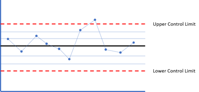
Two out of three consecutive points fall in the area that is beyond two standard deviations from the mean (on the same side of the mean).
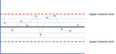
Four out of five successive points fall in the area that is beyond one standard deviation from the mean, either above or below.
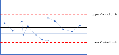
There is a run of six or more points that are all either successively higher or successively lower
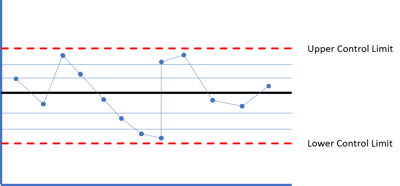
Eight or more points fall on either side of the mean (some organization use 7 points, some 9)
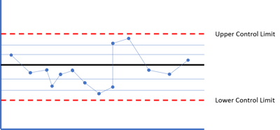
Any of these conditions should trigger the reaction plan since these indicate "signals" that there is some "special cause" (a change to the system) that led to the unusual performance of the system.
Step 8: Identify Root Causes
When an out-of-control condition occurs, this means that it's likely "special cause" variation that is the result of some other process or event. The next objective is to identify the root cause of the variation often done using a PDSA or DMAIC process.
If we have a chart that's "in control" and performance doesn't mean our customer's needs or our organizational goals, we call this "common cause" variation. There are usually many contributors to common cause variation - the different factors that are present in the system every day. We can improve the system when we have common cause variation, but that is usually a less reactive process where "asking what went wrong last period?" is a less useful question.
Step 9: Implement Actions to Improve the Process
Once the true cause of the variation is determined, corrective action can be taken to resolve the issue and improve the process so that it doesn’t recur.
Process control charts are a valuable improvement tool because they visualize process results and make problematic variation easy to spot. Implementing them isn’t complicated, but it must be done with care in order to be effective.



Add a Comment