 Organizations that subscribe to the Lean or Six Sigma business methodology, and others that are devoted to continuous improvement, often use a host of visual management tools to achieve consistency and introduce positive change. Kanban, huddle boards, and value stream maps are all very popular and effective. Process control charts are another valuable visual management tool for recognizing and reacting to process variation.
Here are the details about why they are so useful.
Statistical Process Control
It is probably helpful to begin with a definition of process. A process is quite simply anything that gets done. It could be putting gas in your car, filling out a time sheet, delivering source code to QA, or checking in a patient. Each of these activities results in some output. Sometimes it is a product, but often it is a service or a deliverable to the next process. In addition to the result of the process, data is also generated. Statistical process control is the act of using that data to make the process better. The data might be related to timeliness, cost, quality, or quantity.
Listen to this Post and Subscribe to the Podcast:
Visual Process Control
A process control chart is a method of visualizing a process variable over time. They are useful in almost every industry (although not for every problem). By plotting process results on a chart, you are able to recognize variation in the process and understand the nature of that variation. Like many visual management tools, control charts get you to that “Ah-Ha!” moment more quickly than simply reading a list of data points.
Process Variation
Variation in process variables should always be expected. Process control charts don’t eliminate variation and the object is not to make a process always produce “average” results every single time. There's always some amount of variation in every process. What process control charts do is make the type of variation obvious. They create a stark distinction between “common cause” variation, which must be addressed within the normal process, and “special cause” variation, which is addressed outside of the process.

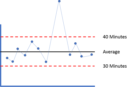
Here’s an example. Let’s say it usually takes you between 30 minutes and 40 minutes to drive to work every day. You can’t predict your exact time on any given day, but you can be pretty sure, based on this chart and the calculated control limits, that it will be between 30 and 40 minutes. These limits are calculated, not arbitrary... and they are calculated based on the normal day-to-day variation that we experience.
The reason that you can’t predict the exact amount of time it takes to get to work even if you leave at the same time of day and take the same route is common cause variation, maybe you miss a light one day, but not the next or traffic runs a little slower from time to time. These are expected, normal events that can’t change, so you simply build them into your expectations.
Now imagine one day you forget to pay your state registration fee and you get pulled over on your way to work. That day, it might take you 60 minutes to get there. Getting pulled over would be a special cause variation. In that case, a separate process (paying your registration) and an unusual event impacted the process you are tracking (driving to work.) If you had a process control chart for driving to work, it might look like the chart at right.
You don’t have to stare at that chart for very long to realize that something unusual happened on the day you got pulled over. That day aside, you have a predictable process for getting to work. It can be said to be a process that is “in control," which means performance is stable and it's predictable within a certain range.
Process Improvement
The reason it is important to understand whether a variation is common or special cause, is that the steps you take to improve the process are different in either case. Let’s say you decide you want to get to work faster. If you continue to leave at the same time of day and take the same route, you can expect the same average time, with the expected normal variation. To reduce the time, you need to change the process. Perhaps you leave earlier or invite a friend to ride along and take the carpool lane. These changes within the process itself may result in improvement. However, they won’t address the special cause of getting pulled over that one time. In order to resolve that issue, you need to do something about your process for paying your registration, not your process for driving to work.
That’s why process control charts are so useful. They tell you where to look for opportunities for improvement. They also let you know if the improvements that you have implemented are producing the intended result against the variable that you are tracking. Control charts can easily be applied to any process that produces data, resulting in a clear path to better performance.


Add a Comment