 Howard Earl Gardner is an American developmental psychologist and the former John H. and Elisabeth A. Hobbs Professor of Cognition and Education at the Harvard Graduate School of Education at Harvard University. He has written hundreds of research articles and more than thirty books that have been translated into multiple languages. He is best recognized for his theory of multiple intelligences, which he explained in his 1983 book Frames of Mind: The Theory of Multiple Intelligences. He argues that people process information differently, and therefore, there are many ways that people learn and process information.
One type of intelligence that Gardner studied is spatial intelligence, which is the ability to gain understanding from pictures or other visuals. While everyone benefits from a different mix of the more than seven types of intelligence, most people tend to respond to visuals because they offer a concrete way to organize abstract information.
What Is Data Visualization?
Data visualization is a method of helping people get the picture. It provides context to otherwise disjointed bits of data. Visualizations include images, graphs, icons, charts, and maps. Smart project managers incorporate data visualization so speed understanding and clarify communications.
People have been visualizing data for eons. Cave paintings are thought to include information about the availability of resources. Ancient Egyptians didn’t rely on verbalizing inventory stores; they created charts. The pie chart we see so often today was invented by the 1800s. Of course today, computers help make incredibly complex information and vast amounts of data easier to understand.
In project management, we use charts, graphs, infographics, and other tools to improve our ability to communicate effectively.
What Makes Visual Project Management Effective?
The thing about data visualization is that it’s a blend of art and science. According to Edward Tufte, (sometimes called “The DaVinci of Data,”) explained that graphic displays should:
- Show the data
- Highlight the substance, make the graphic elements background
- Never distort the data
- Present many data points in a small space
- Make large amounts of data understandable
- Guide the viewer’s eye to what’s important
- Allow the viewer to zoom in for more detail
- Have a clear purpose
- Integrate statistical and verbal description of data
- Have the graphic reveal the data
How Does Data Visualization Apply to Project Management?
Any improvement project, even a small incremental one, can be complicated. The project must align with strategic goals, it may involve multiple people or even departments, there are baselines to track, and activities to manage. When you imagine many projects going on at the same time, you can understand how easy it is to lose track of the details, especially if the information is tracked in a flat form, such as a spreadsheet.
Visual project management tools help bring the information to life, connecting the dots and painting a clear picture of the desired outcome, the current status, and any roadblocks that may be in the way. Visual management becomes a language that everyone can understand and explain.
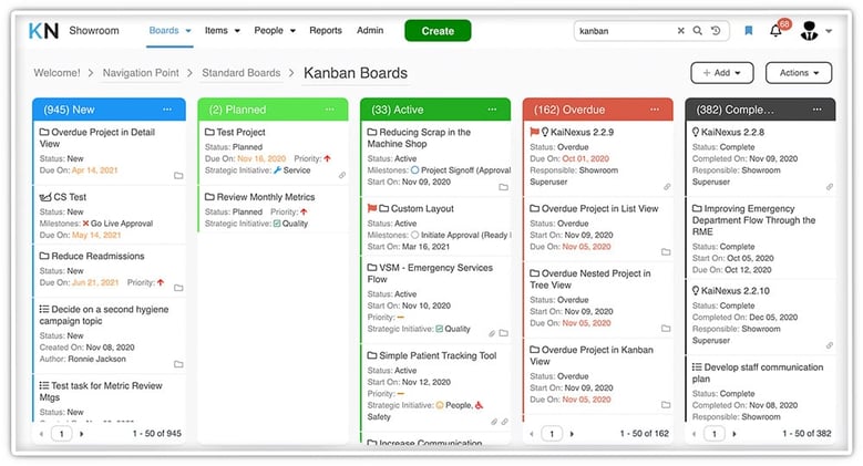
Common visual project management tools include Kanban boards, X-matrices, activity level views, calendar views, team dashboards, and huddle boards. Other visual tools that help guide projects are process maps, control charts, mind maps, and fishbone diagrams.

What are the Benefits of Visual Project Management?
 Teams that move to visual management of improvement project gain several advantages, including:
Better Communication – Written reports or verbal updates can only go so far in effectively sharing the status and results of any given project. Visuals allow for better transparency and appeal to most types of learners.
Improved Collaboration – Many of the most challenging problems organizations face, require cross-functional collaboration for improvement. By visualizing data and through the use of broadcast methods such as wall charts, you can bring teams together and ensure a common understanding of all project details.
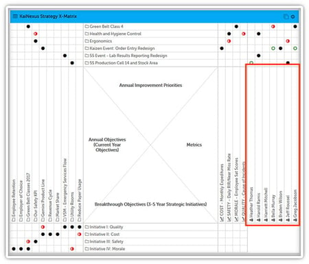
Assured Strategic Alignment – One way to ensure that each project has some relation to the overall goals and objectives of the organization is to draw a line from each project to a relevant KPI or annual objective, literally. An X-matrix is a visual tool that lets team leaders do exactly that, so there is no doubt that each project is strategically relevant.
More Engaged Employees – Under the old method of project management, the project manager would report project status and results in their own way, on their timeframe. With today’s project management platforms geared for continuous improvement, users can access visual data whenever they want on dashboards that are configured for their own needs. This self-service approach increases engagement and gets work done faster.
The benefits of visual project management are clear. Modern technology makes it a straightforward proposition, so there is little need to rely on traditional text-based reporting methods. It’s easy to boost your program to the next level by adding a visual layer to your project management approach.


Add a Comment