 Statistical Process Control (SPC) charts are a useful tool for managing and improving all sorts of processes. They’ve been used in manufacturing for decades and are increasingly popular in other industries, from healthcare to higher education. Control charts give leaders a clear, consistent way to evaluate and discuss process behavior and performance. They help managers make good decisions about which processes are stable and which require attention.
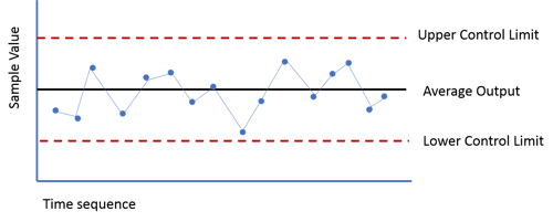
While at first glance, they may look very simple, just a line graph with data points plotted over time, there are some important concepts that you should understand if you are new to the approach.
This post covers the basic, yet critical, principles of control charts.
Process Variables
Process variables are the results of a process that can change with each process output and vary over time. Examples include:
- Time – How long does it take a patient to see the doctor after completing registration?
- Quality – How many defects are found in each batch of widgets?
- Sales Performance – How much revenue does a retail store generate each day?
- Turnover – How many call center staff positions turn over each month?
The process variable is what you are measuring and what your control chart is all about. It should be something that is measurable and that is worth tracking in order to better understand and improve it.
Control Limits
Given that processes vary, it is important to understand which variations in the outputs (measures) come from a stable, in-control process and which are indicative of a process that has gone out of control. To do this, control charts make use of an upper and a lower control limit. These limits are not set based on goals, but are rather calculated and set based on statistical analysis of historical data. In most cases, the upper and lower limits represent three standard deviations from the mean. Learn more about the calculations here.
Common Cause Variation
Some amount of common cause variation is expected and is always present. It is a result of the normal operation of a process and is, generally, the data points that fall within the control limits.
For example, my local McDonald's has a screen that lets employees know how long it has been since a guest in a car in the drive-through placed an order. You would not expect every car to go from order to delivery in exactly four minutes and 30 seconds. There is always variation. The length of the line, the size of the order, and other predictable factors will cause some variation in the order-to-delivery time. If you graphed the amount of time for each car, you would expect the data points to fluctuate somewhere around the average for that time of day. That’s common cause variation.
If you only see common cause variation, your process is in statistical control and you can look for opportunities to improve it. Improvement requires fundamental changes to the process.
Check out this free webinar for help figuring out what variations are common cause vs. special cause:

Special Cause Variation
Special cause variation occurs when something unusual happened to the process, putting it in an "out of control" state. This means that a very low probability outcome has happened. In the McDonald's example, if the average order to delivery time is four minutes and 50 seconds, and the upper control limit is seven minutes and 25 seconds, and you see a time of ten minutes and 52 seconds you know a special cause variation has occurred.
Any single data point outside of the calculate limits is one form of signal. If we see eight or more consecutive points on the same side of the average, that's another signal. The third signal we generally look for us 3 out of 4 (or 4 consecutive) data points that are closer to the same limit than they are to the average. If there are no signals, the process is said to be "predictable" or "in control."
The response to special cause variation is to understand what happened in that particular case, correct it, and look for ways to prevent it from occurring in the future. There's a root cause to be found for special cause variation. There is no simple root cause for common cause variation because, by nature, it's always present.
Process States
There are four commonly understood process states:
The Ideal State – This is when a process is under statistical control and 100 percent of the variables fall within the control limits and there are no other signals found. The ideal state produces predictable, expected results.
The Threshold State – The Threshold state occurs when the process is generally in control, but occasionally exhibits a result beyond the control limits.
The Brink of Chaos State – This is a process that is showing results that are frequently outside of the control limits but is not yet producing defects (or angry McDonald's customers).
Chaos – The Chaos state occurs when the process is both out of statistical control and producing nonconforming results that can’t be predicted.
Chaos is the natural state of any process and unmanaged processes tend to drift toward the Chaos state. Avoiding this regression to Chaos is one of the primary advantages of statistical process control.
While there are statistical principles at play, control charts are a relatively simple method for assessing, managing, and improving processes. They give you insight into the reliability of your process and help managers focus only on variation that requires corrective action or that which indicates a process is ready for improvement.


.svg)


Add a Comment